
To celebrate the end of 2021, we are looking back at some of our best articles this year.
Originally published this past August:
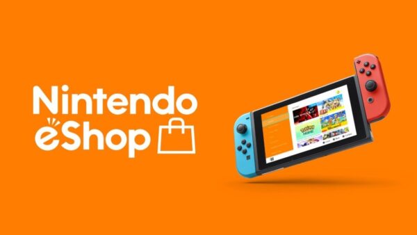
When Nintendo launched the Switch in 2017, it was seen as a new beginning and new chance for success after the Wii U’s failure. But while the system was a sales success, something was lost during the console transition, and more than just Nintendo, it’s costing every developer that puts games on the system. When the Switch eShop is compared to the Wii U eShop, the presentation quality differs greatly and it is clear that while Switch has made advancements in various areas, its eShop is a step backward.
When the Wii U eShop is accessed, you are greeted with a match-three game to play while you wait for the store to load, then music plays. The music changes throughout the year, which provided a sense of welcome and personality to the store. The Wii U eShop also highlights games while having sections for a variety of genres on the main page, meaning the store went out of its way to make things easier for people to find.
The eShop had sections for RPGs, platformers, the virtual console, and more and gamers could even do deeper searched in the various menus. The eShop layout was indie-friendly and ensured many smaller developers got attention and a chance to shine when they would not have otherwise. Various sales would also be highlighted and made to be easy to search in their own way. For all the Wii U’s faults, the system had a well-designed storefront that was both consumer and developer-friendly.
Now, contrast this with the Switch eShop, which feels like a disaster in comparison. There is no music in the store, and it has a very sterile feeling to it. The featured page only shows a small number of games and is separate from everything else, while the search function tends to be a bit of a mess as well.
A big issue is a lack of curation, as the store is flooded with games of all kinds. Some are decent and some are generic shovelware that just clogs up the search functions. Because of this, looking for a game using the search function can be a nightmare, and finding a good game by just browsing the store is difficult.
Many indie devs have noted this, with sales of their games suffering on Switch due to the storefront being so cluttered and difficult to navigate, which has led to some drastic measures., such as lowering their game prices to levels where profits cannot be made. This is done as an effort to get on the Switch bestseller charts so that their games can be noticed by people. This is something developers should not have to resort to, by any means and it speaks to the horrible layout of the store.
The deals page itself is atrocious because all of the games are just thrown there with no organization. The only way to know what is on sale, just by using the system, is to look through the store game by game or hope one of the games on your Wishlist is on sale. Many of these issues were noted when the Switch was just a few months old but were ignored at the time because everyone thought they would eventually be fixed, but it has been years now with no resolution.
Each flaw and each issue with the Switch’s eShop have a direct contrast to the Wii U’s eShop, which shows how much of a step back the Switch took. Curation is surprisingly better on the Wii U while searching, and even simply finding good games and deals, is easier on the Wii U. The Switch barely highlights anything, which means a lot of good games are regularly missed on the eShop. This is not the way to handle an online storefront and, for the sake of both customers and developers, Nintendo needs to fix the store in some way.