
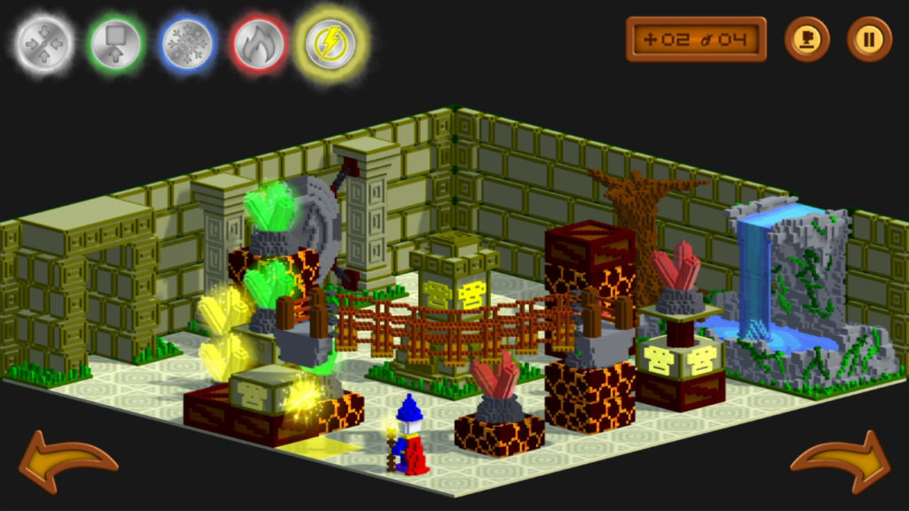
Magicolors from Virtual Arts Studio and QUByte Interactive looks pretty neat at first glance. Voxel graphics, wizards, puzzles, it’s got it all. For a small, low-priced ($1.99) game this seems like it might have potential. It’s big too, with 64 levels and 4 areas, so you’re getting a lot of magic puzzling for your hard earned two bucks. But the real question is whether or not a game is fun, so let’s take a closer look.
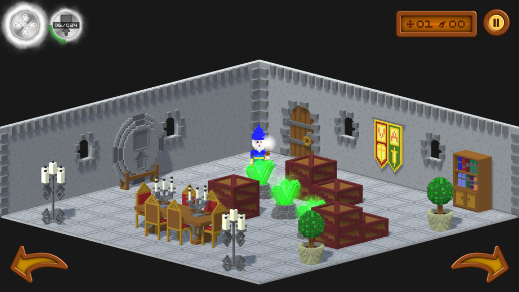
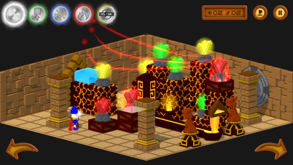
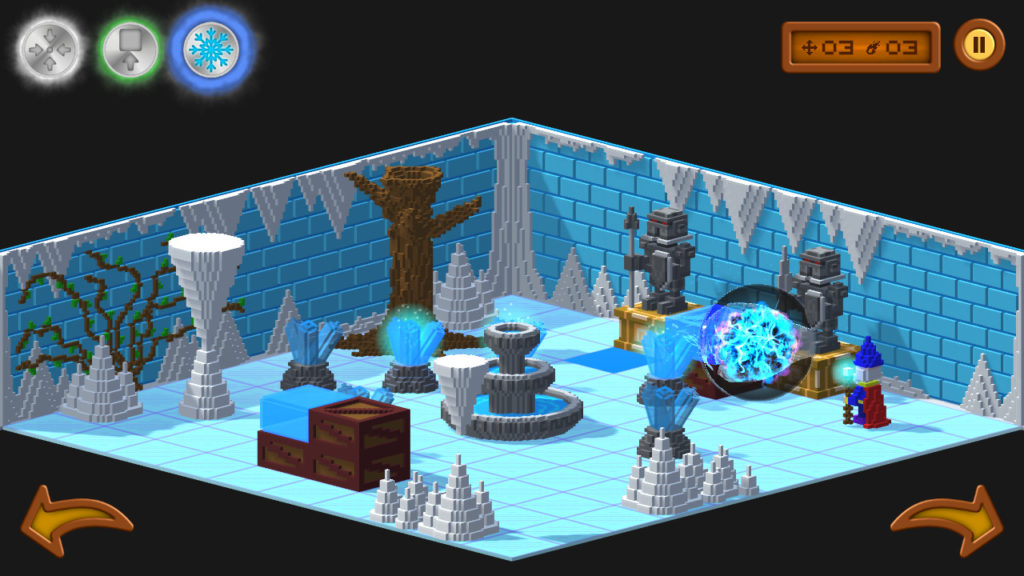
Magicolors consists of a simple concept. Light all the lights in the room with magic in as few moves as possible. Sounds simple, right? It is, but only at first. Rapidly, more and more complex concepts are applied to the game, making it harder and harder to slim down moves to get a better score in a given level. Sure, you can bull your way through if you don’t care how many moves it takes, but that’s not a challenge. Doing it right means taking your time, thinking, and planning your moves, and that’s where things get a bit challenging. Magicolors starts with positioning, and then adds spells to complicate things. You might have to knock blocks out of a stack with a spell to get the right alignment of lights. You might have to melt or burn things to open or close the right areas. Even lightning responds to your commands, and as the spells multiply, so does the difficulty of the puzzles.
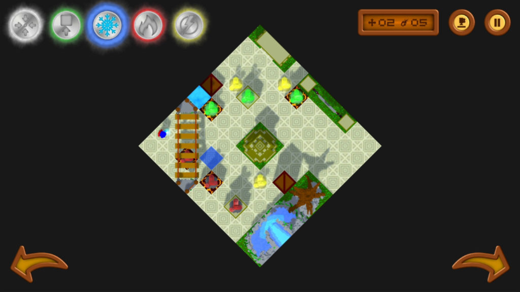
Unfortunately, not everything is roses in this voxel kingdom, especially in regards to the Switch. Magicolors was originally released at the end of 2019 on Steam, and during the port to the Switch, some key elements were rather overlooked. Chiefly among them is the ability to highlight objects accurately. Puzzles in Magicolors require you to target specific blocks and areas in order to fire your magic in such a way as to hit all the lights and complete the levels. You can shift to an overhead perspective to make sure you’re lined up, but then if you want to go up and down a tier, it’s not as simple as using the d-pad. You instead have to have the spell highlighted and then move up and down with the stick, often times accidentally moving your target square in the process. It’s very difficult to line up your shots in even the easiest puzzles and the angles, even with being able to shift each room a full 360 degrees, are very difficult to align.
It would have made sense to have touch controls. Simply highlight what you want to hit with a tap once you’ve tapped the right spell, but unfortunately, that’s not the case either. You can switch spells with tap but tapping the screen just makes the wizard walk around burning moves. There’s also no vertical level control for targeting, which means that if you do manage to line up your shot on a grid, it’s even harder to select where you want to fire, even though you’re supposed to be able to shoot diagonally up and down. Add to that the fact that your room is square but the controls are aligned at 45 degrees, making it almost impossible to like up on a specific square in some instances and you’ve got a recipe for frustration. This likely worked just fine on the PC with a mouse, but on a Switch, it’s absolutely infuriating.
If you manage to have the patience to figure out just how to move, restart the level over and over again until you manage to do what you need to in the shortest number of moves to maximize your points, and open up new levels, you’re a rather patient person. The music constantly bombarding you while you attempt it is so fluffy and irritating that it’s easier to play with no sound at all. All the sound in the game is basic and irritating. On top of that, the wizard gives helpfully vague hints about what to do if you keep screwing up, but the actual tutorial isn’t very good at ascribing your specific motions, so you just get told over and over again how to do something that you can visibly see how to do but are unable to translate into actual movements to beat a level. It’s rage-inducing to be able to see exactly what needs to be done and simply fail to do it over and over due entirely to a hideously designed control scheme.

Controls this bad are simply inexcusable in this day and age and even the slightest playtesting of a port like this would have shown the magnitude of the errors made here. Unfortunately, that was not the case, and this is easily one of the worst designed games for the Switch ever in terms of gameplay. One of the interesting things about a game this bad being readily available is that it shows that Nintendo doesn’t actually care one bit what content is on their system or store. They just want a cut of the profits. If they cared about the quality of their digital library, this wouldn’t even be available to purchase. Indie definitely doesn’t always mean good.
Magicolors would be a fun little puzzler if you could actually play it, and maybe there are some people out there who have the patience to bother with a cheap, simple puzzler with bad controls on their multi-hundred dollar system that has amazing games available, but chances are, not many. From top to bottom, this is an absolute shovel-ware game that isn’t worth playing and likely should be avoided, even for $2.

This review was based on a digital copy of Magicolors provided by the publisher. It was played on a Nintendo Switch in both docked and undocked modes and was equally horrible in both. Magicolors is also available for Steam and MacOS in case you also like to hate yourself at the computer (although it’s likely more playable there).

